About the Project
Web Weekend is a three day event held in New Orleans for internet based video content creators, hosting conferences, networking events and interactive workshops. I had the pleasure of developing the site based of a provided design.
My Role
As the lead developer, I worked with their design team to build the front-end functionality they wanted their site to display. The design brought along with it a few challenging issues to fix, but finding the solution advanced my skills.
Animation
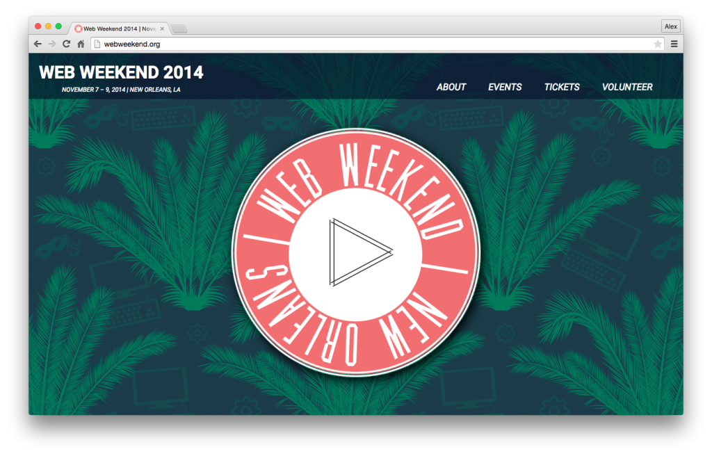
By far the most challenging section was the rotating home page image. Animating the rotation on it’s own wasn’t too hard, but the “play” button on the middle needed to sit still. Then, when someone hovered over, it needed to fade to black and display page content that could be changed easily. On top of that, the whole image, with it’s complex features, needed to be responsive, allowing the image and text to resize to fit the width of each screen it was viewed on.
There were a number of avenues to go down for each separate feature, but all at once greatly reduced my options. My research and testing brought me to viewport units, vh, vw, and more specifically, vmin. After removing all the previous percentage and media query code, I re-wrote the animation using vmin, allowing the circle logo to resize while keeping it’s 1:1 aspect ratio.
Submission Forms
Not every aspect of the design was finalised when I began developing. The contact forms for example, were a work in progress. With the style of the website in mind, I created a large submission form using full and half width boxes. With a navy background, the same as the header, and white text that appeared once typed in, the design fit the rest of the site well, and I got the go ahead to create the rest with the same style.
View the live site: Web Weekend
